Finally had a chance to pick up a blaster of this stuff, which I’d been waiting for fairly eagerly since I saw the sell sheets. How’d I do?
Not too bad, I suppose.
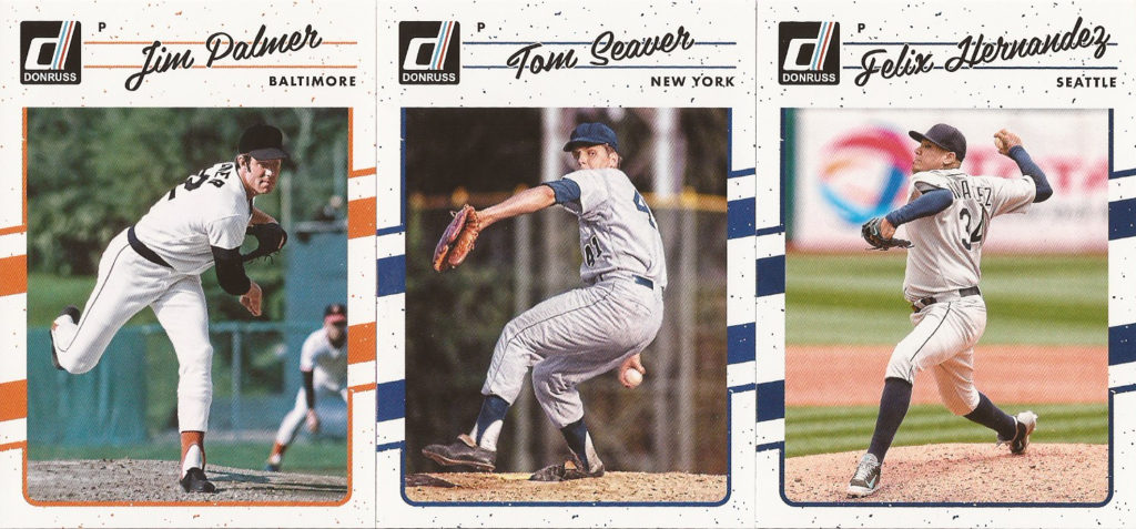
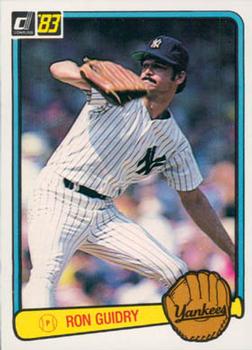
If you’re seeing this year’s set for the first time: yeah, they riffed on 1990 Donruss baseball, which was…not many peoples’ favorite card design, but they managed to make it look solid just by making it not look red.
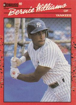
Just for a quick comparison, here’s Bernie Williams’ rookie from that set (sorry for the low-res pic, I just screenshotted it from Trading Card Database because all of my ’90s are upstairs). Now, by itself, it’s a fine looking card. Bernie being on it helps. But if you have to look at 716 of these, you’re probably not gonna be thrilled.
Anyway, Donruss changed their logo, added those diagonal stripes on the border, and rounded the corners of the pictures, but it’s a clear homage.
If this is the first time you’re seeing modern Donruss cards, you may be noticing that they don’t have logos or team names on them. They’re licensed by MLBPA, but not MLB. I will say that this seemed to limit their photography, or just the overall look of the base cards, a bunch this year, if only that it made the cards look kinda monochromatic.
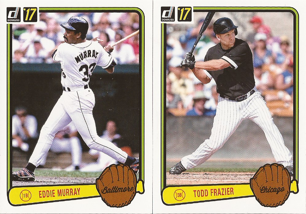
It’s not as much of a problem in their 1983 Donruss homage inserts. The border colors help here. I wish the player name font had been a little more accurate…
(Also from TCDB, for quick comparison. Name lettering doesn’t look as…tense.)
…but otherwise, I’m more inclined to chase the 1983 inserts than I am the base set, after grabbing a blaster.
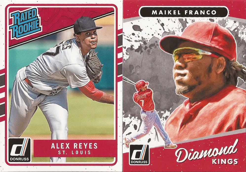
Some of that has to do with these cards, which are part of the base checklist, being seeded about 1 every 4 packs. There’s a reason why this set is selling for about $160 on eBay, and it’s because it’s very, very difficult to complete. By comparison, the 1983s, which are not part of the main checklist, come in at 2 per pack. After 7 packs, I’m over a quarter way through that set, and I’ve got 2 out of 45 from this part of the base set. It’s an old complaint with modern Donruss, they’ve been doing this every year since the brand relaunched in ’14, but this is the first time I’ve really looked at the numbers.
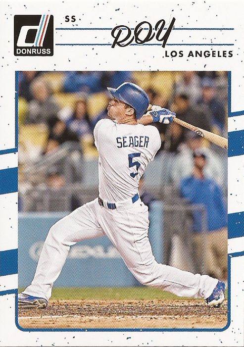
Then you throw in stuff like base variations (here, they’ve replaced Corey Seager’s name with “ROY” because he won Rookie of the Year), and it just gets to be a headache.
(This one’s already been traded to Night Owl.)
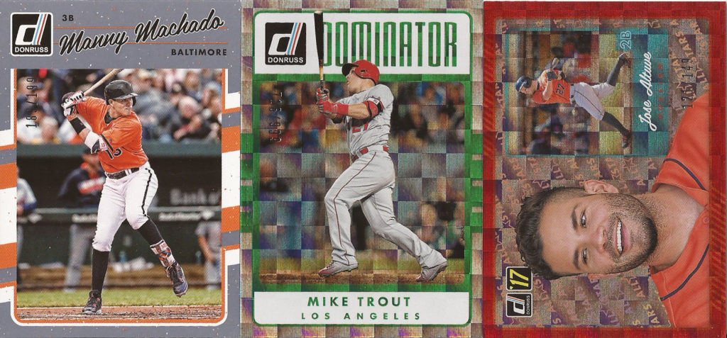
I did get some cool inserts, though. I mean, on a set like this, you can’t complain about these 3 names on numbered cards. Keeping the Altuve, the Trout’s definitely up for grabs (or going to COMC if it doesn’t go before I send out my next shipment), and I’m still deciding on the Machado (I don’t collect him, but it’s a nice looking parallel and it’s low-numbered).
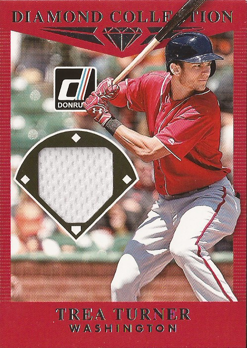
They’re also seeding “hits” in every blaster this year (dunno if this is a new practice or not), and this is what I got. This is available for trade for the time being, too.
So, I’d say it wasn’t a waste of a blaster (or the money), but I wasn’t overwhelmed by it, either. I do like the Altuve card, and the base cards look good, but the short-prints at the front of the set checklist (unlike something like Topps Heritage, where they put them at the back where you can deny they exist) are a psychological deterrent to collecting this stuff seriously. It kinda does the opposite of what Panini wants it to do, I think. People want a run of 1-whatever, not 46-whatever, and they’re generally not willing to drop $3 a card to get there, especially without team logos.